Despite their sometimes deceptive appearance, watches are never truly symmetrical. Subtle shifts and disruptions in their geometrical rhythms infuse them with a dynamic touch and sometimes even define their identity.
 Symmetry is the most obvious means of creating a sense of aesthetic order in an object. Our brain instinctively responds to it, as confirmed by our positive reactions to the famous golden proportion that is so widespread in nature. However, if adopted in an excessively strict manner, absolute symmetry is totally boring, since it has no internal dynamic. The great classical works only appear to apply this principle. For example, the Parthenon in Athens gives the impression that its steps and columns are parallel, whereas they actually lean inwards and are convergent. The ancient Greeks had already understand that perspective influences our perception and endows objects with enhanced meaning and strength. Pure symmetry therefore has no place in watchmaking. The aim must be to divert it in order to adapt it to other laws of visual equilibrium.
Disrupting the rhythm
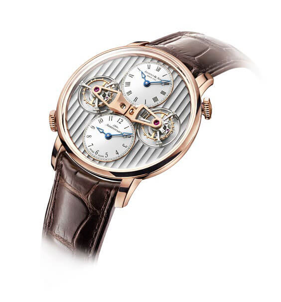
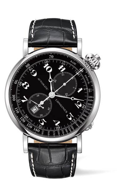
 There are many ways of breaking the monotony of exact symmetry. Breguet disrupts the left to right rhythm by offsetting the small seconds of its Classique 7147 between 5 and 6 o’clock, almost like a prop that holds everything together. Beneath the apparently perfect symmetry of its dials, Arnold & Son introduces subtle deviations, as exemplified in the Instrument DTE. Its two tourbillons are placed opposite each other, its Côtes de Genève are lined up on the dial, yet its two crowns have ‘slipped’ to 2 and 7 o’clock respectively. Longines actually pivots the entire case of its Avigation Watch Type A-7 by 60 degrees, so that the watch is legible vertically in all natural wrist positions.
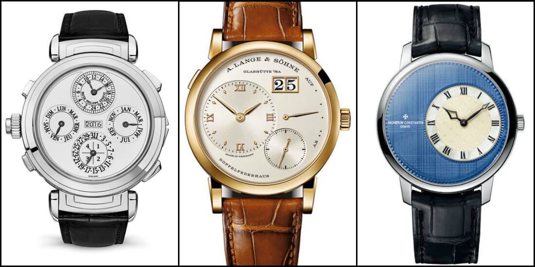
The subdials and counters are indeed the fundamental points of reference that must enliven the dial. With its four traditional indications positioned at the cardinal points of the watch face, a perpetual calendar runs the risk of looking predictably monotonous. Fortunately, the moon phase adds a colorful crescent that avoids such an aesthetic mishap. The calendar face of the 6300 Grandmaster Chime by Patek Philippe, which plays on a mirror effect along two axes, is thus a notable exception.
Receding perspective lines
 The important factor in watchmaking design is indeed not about creating a mirror image, but rather achieving a balance between respective masses. That is why the small seconds at 6 o’clock works so well, since it is exactly opposite the brand name at 12 o’clock. The same principle applies to the Hora Domus by Bulgari. Its six apertures appear to reflect each other, yet their shapes and colors are different and trick the eye just enough to procure visual satisfaction. This balance also explains the distinctive layout of Lange 1 models by A. Lange & Söhne : all the indications are placed along secondary axes of symmetry. Nonetheless, some off-centering decisions correspond to ergonomic requirements. The Métiers d’Art Élégance Sartoriale by Vacheron Constantin is deliberately offset to the right to make it easier to read under a shirtsleeve. Crowns offset at 5 o’clock, a frequent feature of diver’s watches, protect the wrist from the potential rubbing of the winding-crown. The Récital 18 The Shooting Star® from Bovet is thicker at 12 o’clock than at 6 o’clock so as to showcase the movement at an angle that makes the watch even more appealing for spectators. And the RM 59-01 by Richard Mille has a case that is thicker on one side than the other : might that be to ensure that the sprinter Yohan Blake, who inspired this model, can streak even faster through a 100m race ?


